Creating Graphics with ggplot2
Overview
Teaching: 120 min
Exercises: 120 minQuestions
How can I create graphics in R?
Objectives
To be able to use ggplot2 to generate publication quality graphics.
To apply geometry, aesthetic, and statisics layers to a ggplot plot.
To manipulate the aesthetics of a plot usng different colors, shapes, and lines.
To improve data visualization through transforming scales and paneling by group.
Plotting our data is one of the best ways to quickly explore it and the various relationships between variables.
There are three main plotting systems in R, the base plotting system, the lattice package, and the ggplot2 package.
Today we’ll be learning about the ggplot2 package, because it is the most effective for creating publication quality graphics.
ggplot2 is built on the grammar of graphics, the idea that any plot can be expressed from the same set of components: a data set, a coordinate system, and a set of geoms–the visual representation of data points.
This is exactly the model that we were exploring earlier.

Beyond these ideas discussed yesterday, the key to understanding ggplot2 is thinking about a figure in layers. This idea may be familiar to you if you have used image editing programs like Photoshop, Illustrator, or Inkscape.
Before we begin learning how to implement these steps in code however, let’s refresh our memory on the process of describing a figure.
Challenge 1
Watch the video above from the BBC in which Hans Rosling walks us through a data visualisation. Since we haven’t discussed anything about animation yet, let’s just focus on a single frame.
- What are the data variables being displayed in this plot?
- What aesthetics are they mapped to?
- What geometries are they represented with?
- What are the scales and coordinate system used?
Solution
Data Variable Aesthetic Income per person x Axis Life expectancy y Axis World region Colour Population Size The data is shown using points, with a linear scale for life expectancy, a logarithmic scale for income per person, and a categorical scale for world region. The standard coordinate system for this sort of figure is the Cartesian coordinate system.
If this data seems familiar to you, it’s because you have already spent a great deal of time with it. Before making some plots, let’s get our brains back into R mode:
Challenge 2
Make a new project for this lesson and initialise a git repository.
Add the gapminder data from this link (or from your previous R lesson directory) to a
datafolder in your new repository.Commit the data to the git repository.
Open a new script and use
read_csvto read in the gapminder data and assign it to a variable calledgapminder. (Hint:read_csvcan be accessed through thetidyversepackage).Because our example figure uses only the data from 1977, create a new data frame called
gapminder_1977and assign it the data just from 1977 using thefilter()function.Commit the script to the repository
library(tidyverse)

gapminder <- read_csv("data/gapminder_data.csv")
gapminder_1977 <- filter(gapminder, year == 1977)
We’ll work with the gapminder dataset throughout the day to make several plots to explore the data and learn how to construct a plot. Without getting too concerned about the details of specific commands for now, let’s see an example of how to turn our description of the gapminder plot into code.
ggplot
The first important function to learn is ggplot(). This function lets R know that we’re creating a
new plot. Any visualisation process starts with the data you are displaying, so we will provide
the gapminder data as the data argument of the function.
ggplot(data = gapminder_1977)

Obviously nothing interesting is shown yet, because we have not told R what to do with the data yet.
The next step in our process is mapping our data variables to particular aesthetics in the final plot.
For this, we will use the mapping argument to ggplot(). For this argument, we will use the aes()
function, in which we link an aesthetic name with a variable in our data (using the column name in
the data frame).
ggplot(
  data = gapminder_1977,
  mapping = aes(x = gdpPercap, y = lifeExp, colour = continent, size = pop)
)
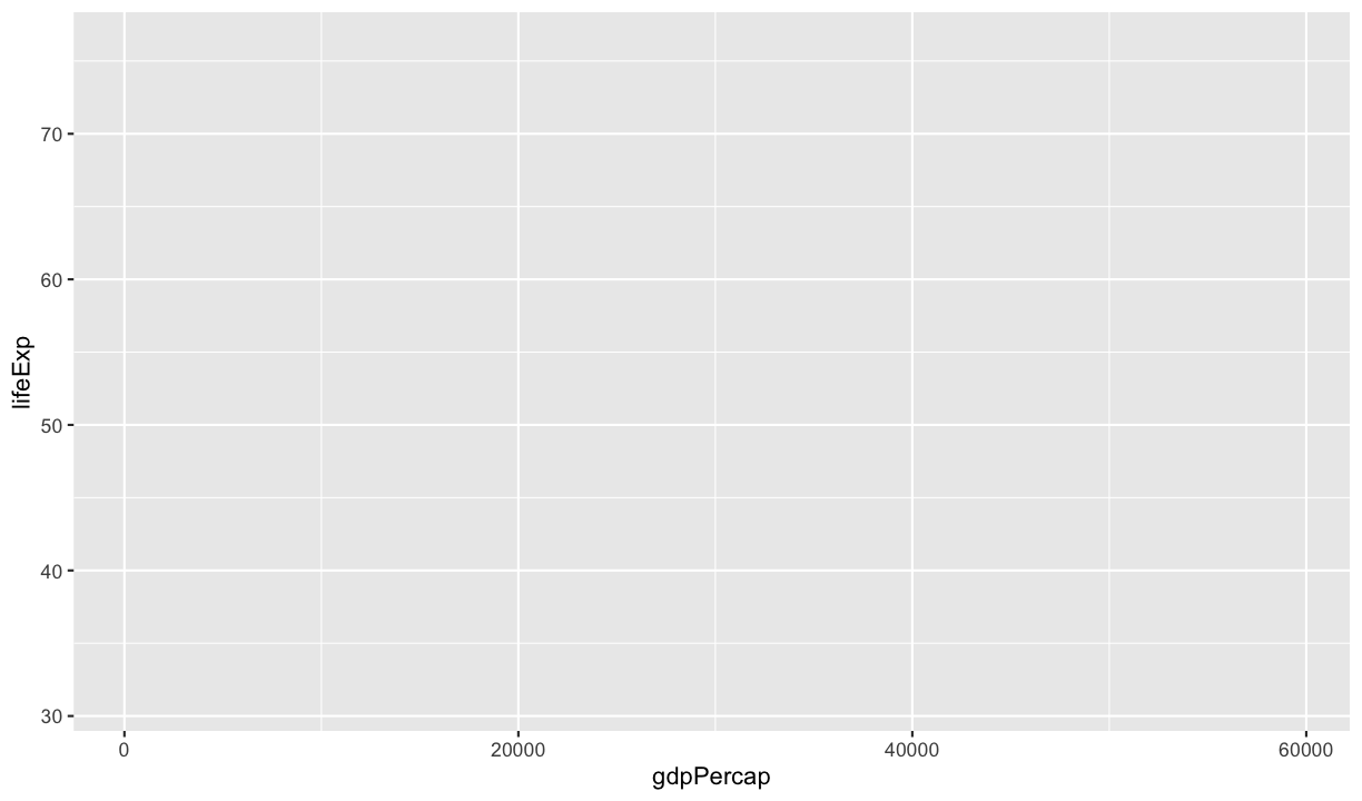
In this aes() function, we are telling ggplot that it should map the data in the gdpPercap column
to the position on the x axis, the data in the lifeExp column to the position on the y axis, the data
in the continent column to the colour of plot elements, and the data in the pop column to the
size of the plot elements.
Challenge 3
What has changed in this plot and why?
Solution
We now have some axes, but not much else. Because we have provided some aesthetics to work with,
ggplot()fits some default scales, coordinates and themes to our data. This effectively sets up a plotting environment for us to work with.
To get something a bit more interesting happening, we need to provide a geometry to which these
aesthetics can be applied. In this case, we want a point geometry, which can be added to the plot
using the geom_point() function. Notice in the code below that we are adding the geom to
the base plot above. This shows the layered nature of building a plot. We will continue adding
additional layers later that will add to how the plot is displayed.
ggplot(
  data = gapminder_1977,
  mapping = aes(x = gdpPercap, y = lifeExp, colour = continent, size = pop)
) +
  geom_point()
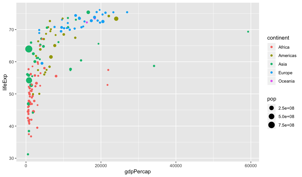
Now we are getting somewhere. This is the first thing we have produced that might actually be called a ‘plot’. This basic structure:
ggplot(<DATA>, <AESTHETIC MAPPING>) + <GEOMETRY FUNCTION>
is all you need to get started.
Discussion
What is still missing from the figure and not provided by the default settings?
The final step in creating something that looks closer to our example image is to add a logarithmic
scale to the x axis. Like adding the point geometry layer, we will add a scale to the plot using the +.
ggplot(
  data = gapminder_1977,
  mapping = aes(x = gdpPercap, y = lifeExp, colour = continent, size = pop)
) +
  geom_point() +
  scale_x_log10()
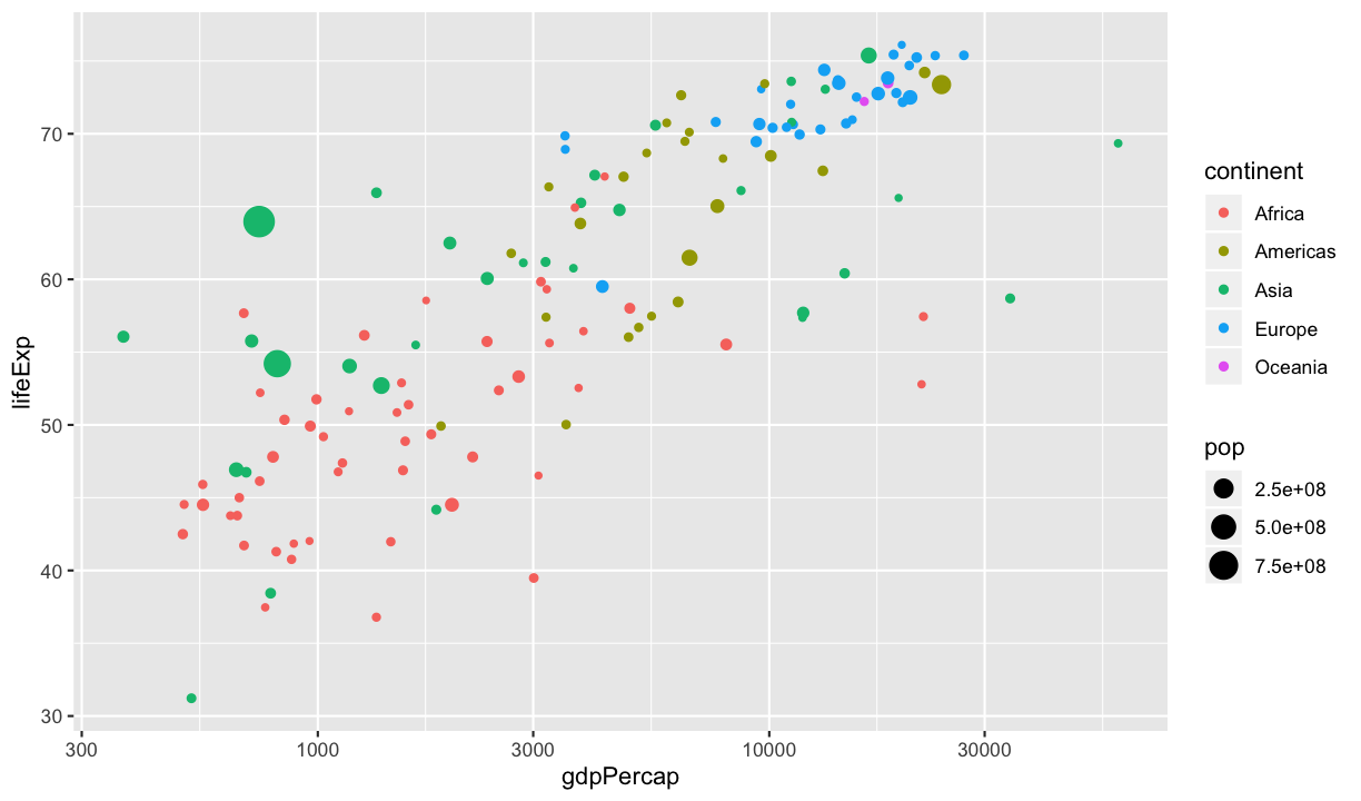
And so we have created something pretty close to the image from the video with a few short lines of code that describe the process of building the plot. We provided some data, and mapped the data values onto aesthetic properties (using a log scale to adjust this mapping for one variable), then applied these aesthetics to a point geometry to produce a scatter plot.
Once you are comfortable with the core concept, creating any plot you want is a matter of working through the same process.
Challenge 4
There are six variables in the
gapminder_1977data frame,country,year,pop,continent,lifeExp, andgdpPercap. Although asyearcontains just the value1977it is not that informative.Using the template:
ggplot(gapminder_1977, aes(x = <VAR1>, y = <VAR2>, colour = <VAR3>)) + geom_point()experiment with substituting different combinations of the data variables into the three positions.
How do the default parameters treat the different variables?
Digging Deeper
Aesthetics
To start looking a little more closely into the details of how this all works, we will begin with
the aesthetic mappings. In our example, this mapping was defined in the ggplot() call. In this situation,
the mapping is a global one – it will be applied to every geom added to the figure.
The mappings are also able to be defined in each geom function. In this case, the mapping is specific to that geom and is not applied to other elements of the figure.
With only a single geom in the figure, these two forms will produce identical plots:
ggplot(
  data = gapminder_1977,
  mapping = aes(x = gdpPercap, y = lifeExp, colour = continent, size = pop)
) +
  geom_point()

#######

ggplot(
  data = gapminder_1977
) +
  geom_point( mapping = aes(x = gdpPercap, y = lifeExp, colour = continent, size = pop) )
This will be useful as we start adding multiple geoms and want to change the aesthetic mappings for each layer. Or in situations where we may be using multiple geoms that don’t all understand the same aesthetics.
Challenge 5
The aesthetics that can be mapped to a geom can be found in it’s help file under the heading Aesthetics. Review the help file for the
geom_point()we have been using and list the aesthetics it can understand. What do you think they do?Solution
- x
- y
- alpha
- colour
- fill
- group
- shape
- size
- stroke
Mapping vs Setting
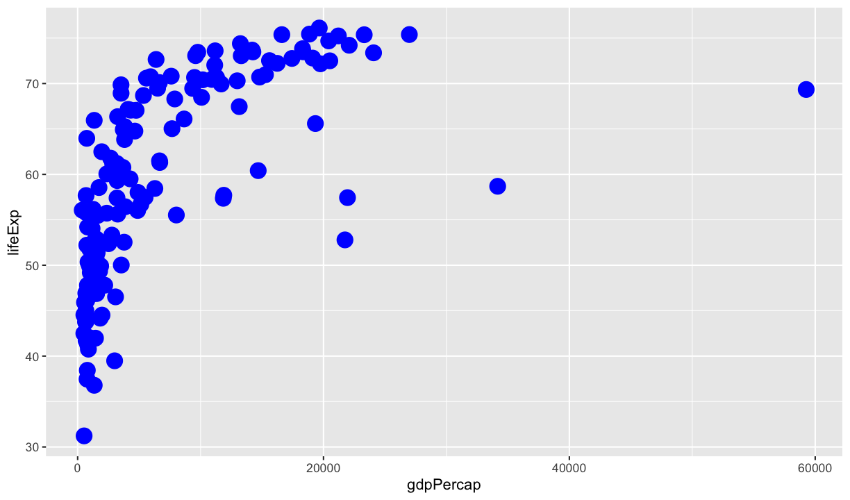
When mapping aesthetics (inside an aes() function), the value the aesthetic takes is determined
by the data. We can instead set the value of an aesthetic directly by assigning it outside of the
aes() function.
ggplot(gapminder_1977, aes(x = gdpPercap, y = lifeExp)) +
  geom_point(colour = "blue", size = 5)
Challenge 6
Using the code from our example gapminder plot:
 ggplot(
 data = gapminder_1977,
 mapping = aes(x = gdpPercap, y = lifeExp, colour = continent, size = pop)
) +
 geom_point() +
 scale_x_log10()
try setting some aesthetics in the
geom_point()function (See solution to Challenge 5 for a list of possible aesthetics). What happens if you set an aesthetic that has already been mapped to a data variable?Solution
Setting an aesthetic overrides the mapping.
Layers
We’ve talked about these steps as adding layers to a plot, but so far we haven’t really taken advantage
of that. By adding multiple geoms we can build up to creating quite complex figures. To demonstrate
this, we are going to go back to working with the complete gapminder data frame.
Challenge 7
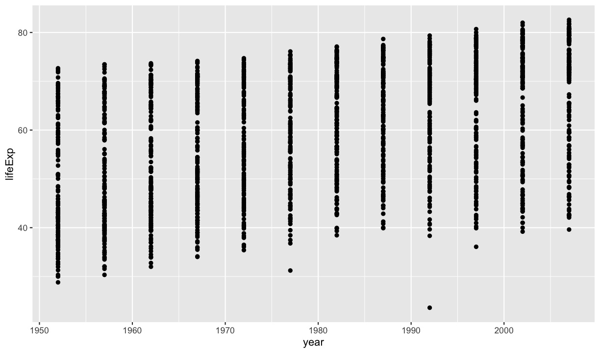
Create a scatterplot using
gapminderthat shows how life expectancy has changed over time:Hint: the gapminder dataset has a column called
year, which should appear on the x-axis.Solution
ggplot(data = gapminder, mapping = aes(x = year, y = lifeExp)) + geom_point()
Using a scatterplot probably isn’t the best for visualising change over time however.
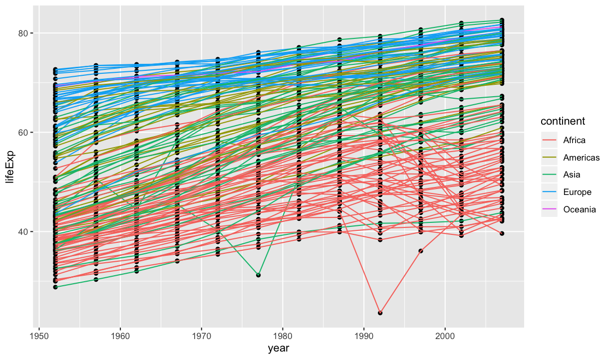
Instead, let’s tell ggplot to visualize the data as a line plot:
ggplot(data = gapminder, aes(x = year, y = lifeExp, group = country, color = continent)) +
  geom_line()

Instead of adding a geom_point layer, we’ve added a geom_line layer. We’ve also
added the group aesthetic, which tells ggplot that each country should get it’s own line.
But what if we want to visualise both lines and points on the plot? We can simply add another layer to the plot:
ggplot(data = gapminder, aes(x = year, y = lifeExp, group = country, color = continent)) +
  geom_line() +
  geom_point()
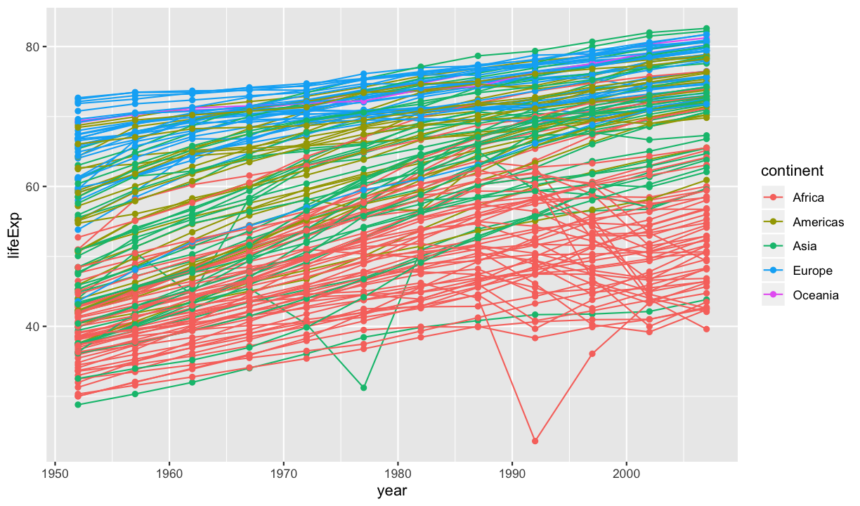
It’s important to note that each layer is drawn on top of the previous layer. So in this example, the lines are drawn first, and then the points are drawn on top of the lines.
Challenge 8
Modify the code from the example above so that only the lines are coloured by continent and the points remain black.
Then switch the order of the
geom_line()andgeom_point()layers. What do you notice?Solution
This could be done either by moving the mapping of colour to continent to be within the
geom_line()function:ggplot(data = gapminder, aes(x = year, y = lifeExp, group = country)) + geom_line(mapping = aes(colour = continent)) + geom_point()
or by setting the points to be black:
ggplot(data = gapminder, aes(x = year, y = lifeExp, group = country, colour = continent)) +
  geom_line() +
  geom_point(colour = "black")
Swapping their order changes the order they are drawn on the plot so that now the points are under the lines.
ggplot(data = gapminder, aes(x = year, y = lifeExp, group = country, colour = continent)) +
  geom_point(colour = "black") +
  geom_line()
Other geoms?
There are a wide array of geoms that you can add to your plots beyond the points and lines we have
shown so far. The ggplot2 cheatsheet
provides examples of different geoms available, as well as descriptions of the characteristics of
the data that is appropriate for each.
Transformations and statistics
ggplot2 also makes it easy to overlay statistical models over the data. To
demonstrate we’ll look at the relationship between life expectancy and GDP across the entire
gapminder dataset:
ggplot(data = gapminder, mapping = aes(x = gdpPercap, y = lifeExp)) +
  geom_point()
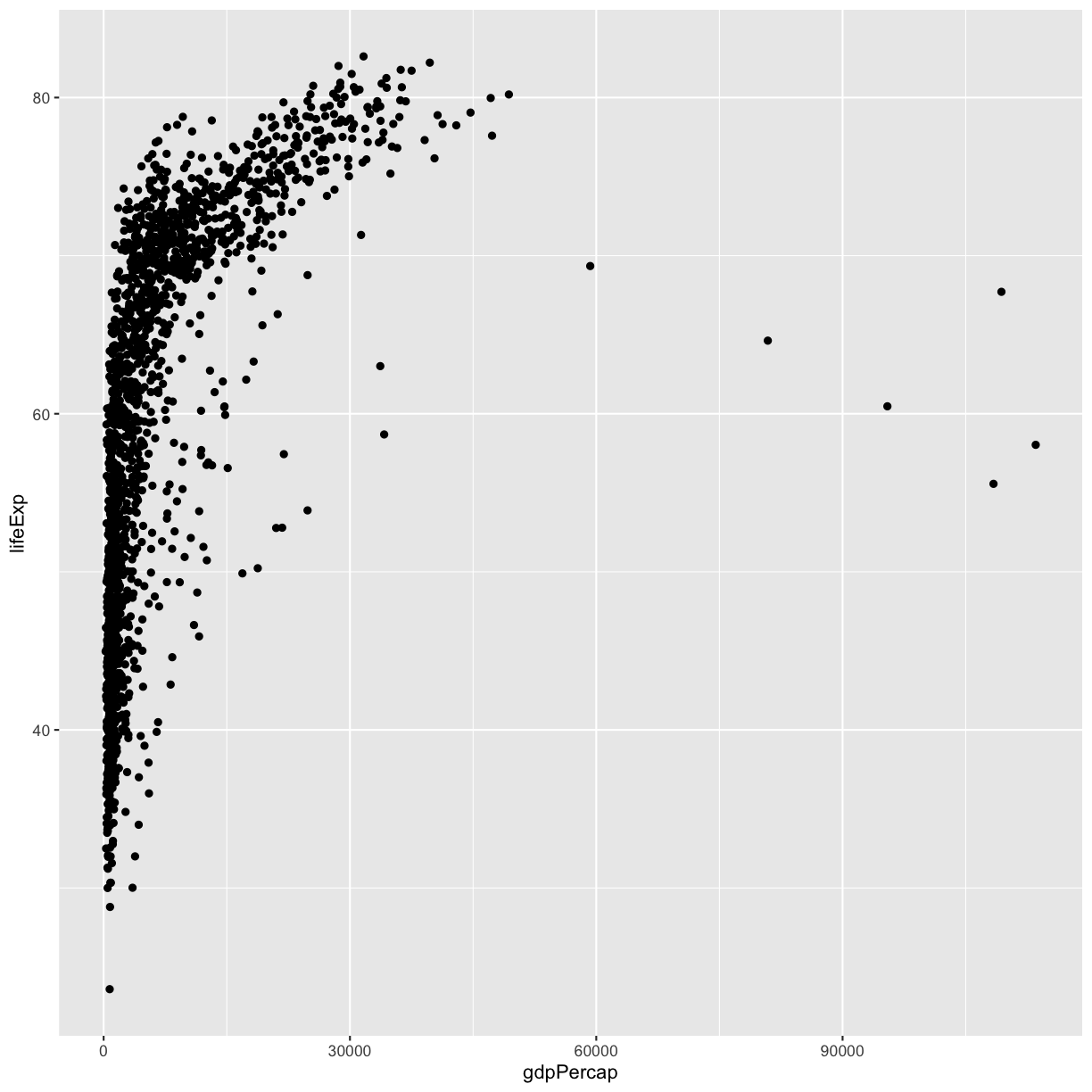
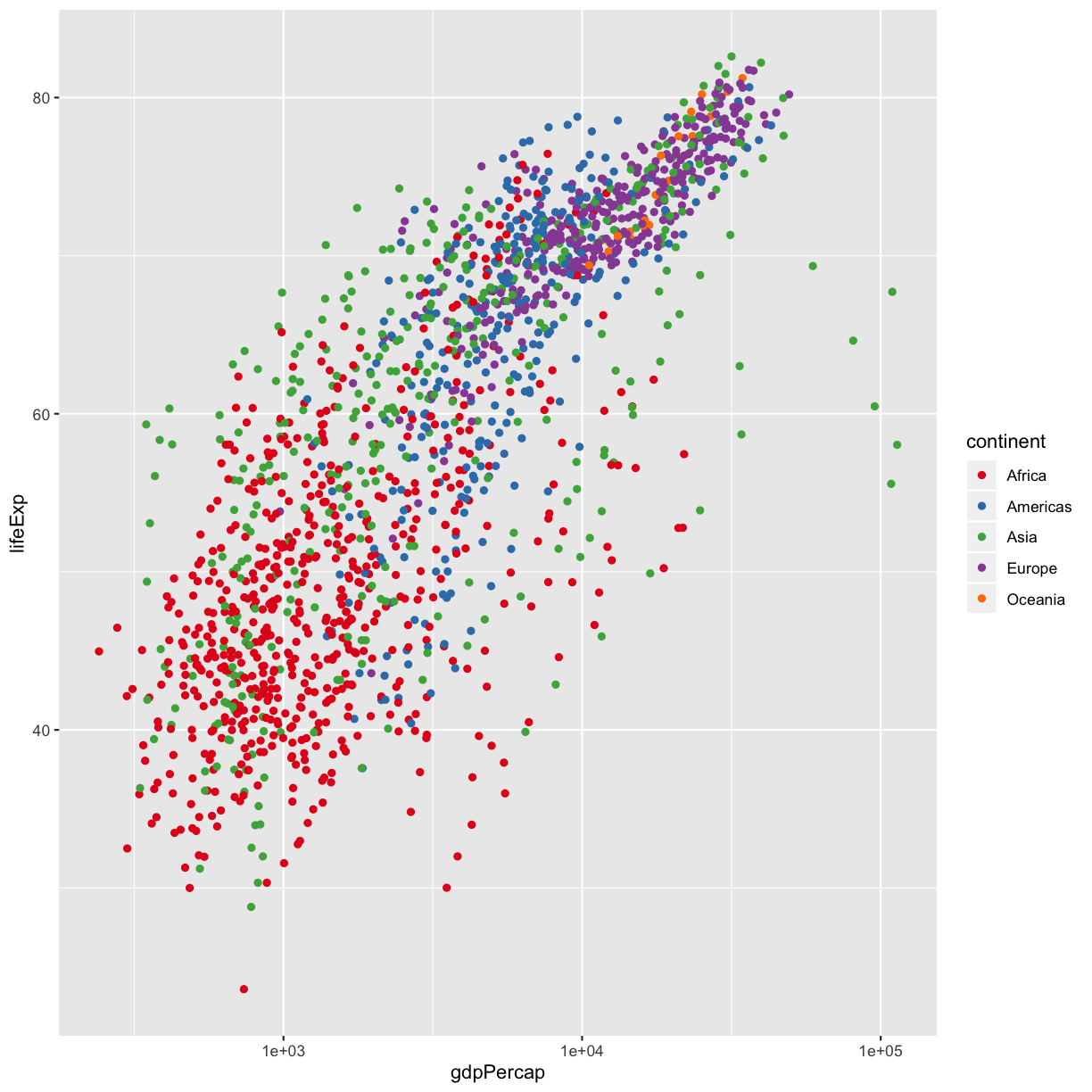
Currently it’s hard to see the relationship between the points due to some strong outliers in GDP per capita. We have seen how we can change the scale of units on the x axis using the scale functions. These control the mapping between the data values and visual values of an aesthetic. We can also modify the transparency of the points, using the alpha function, which is especially helpful when you have a large amount of data which is very clustered.
ggplot(data = gapminder, aes(x = gdpPercap, y = lifeExp)) +
  geom_point(alpha = 0.5) +
  scale_x_log10()
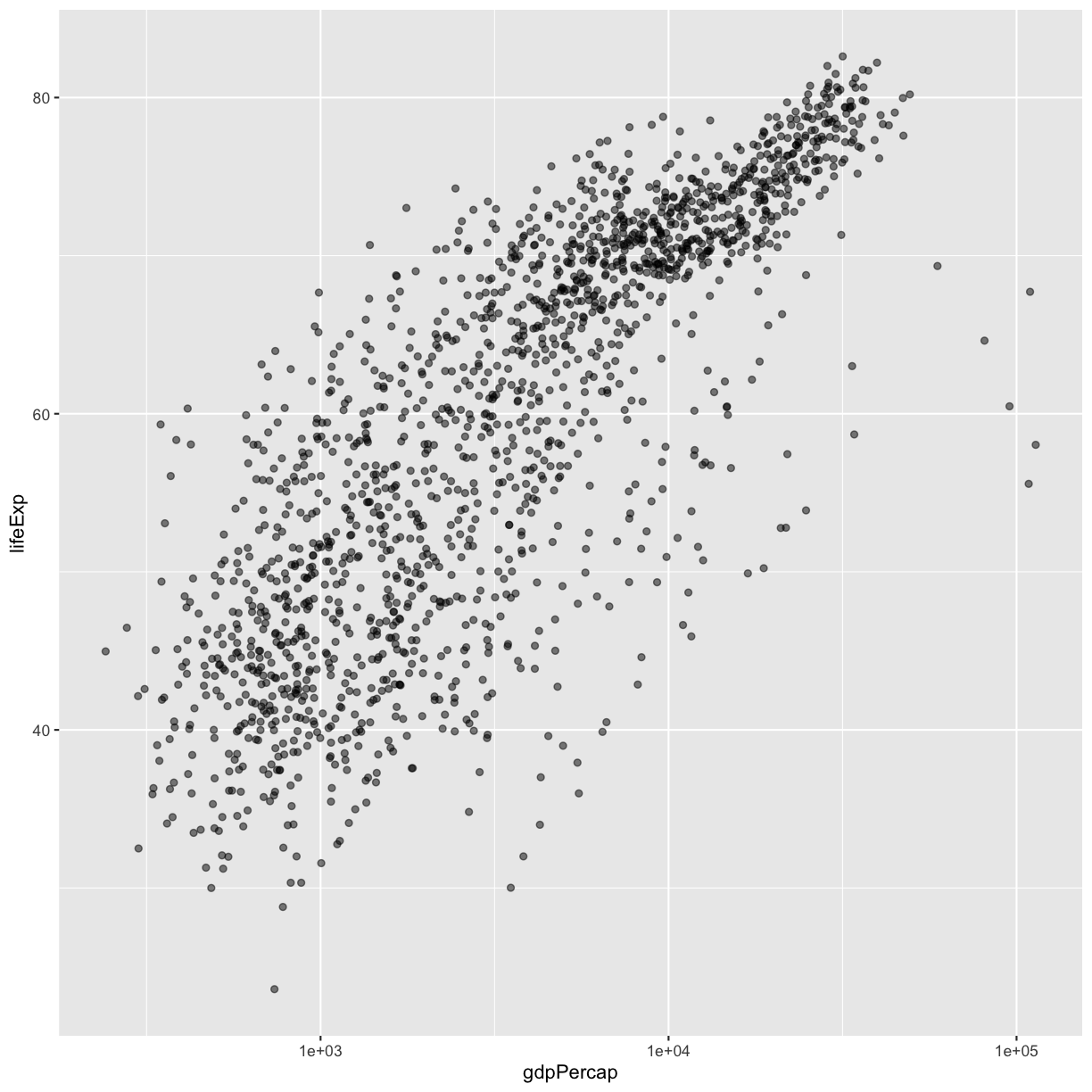
The log10 function applied a transformation to the values of the gdpPercap
column before rendering them on the plot, so that each multiple of 10 now only
corresponds to an increase in 1 on the transformed scale, e.g. a GDP per capita
of 1,000 is now 3 on the y axis, a value of 10,000 corresponds to 4 on the y
axis and so on. This makes it easier to visualize the spread of data on the
x-axis.
Tip Reminder: Setting an aesthetic to a value instead of a mapping
Notice that we used
geom_point(alpha = 0.5). Setting an aesthetic outside of theaes()function will cause this value to be used for all points, which is what we want in this case. But just like any other aesthetic setting, alpha can also be mapped to a variable in the data. For example, we can give a different transparency to each continent withgeom_point(aes(alpha = continent)).
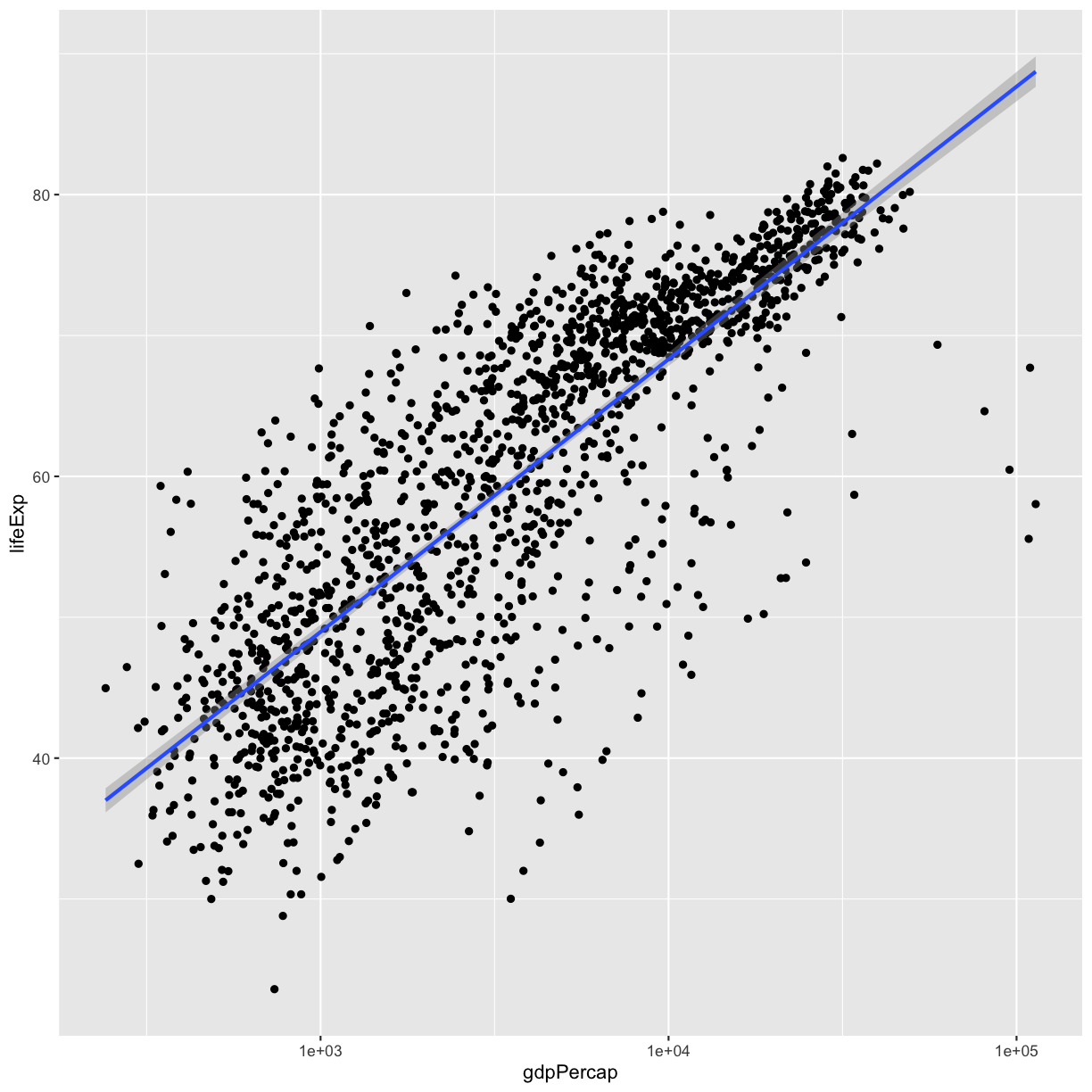
We can fit a simple relationship to the data by adding another layer,
geom_smooth:
ggplot(data = gapminder, aes(x = gdpPercap, y = lifeExp)) +
  geom_point() +
  scale_x_log10() +
  geom_smooth(method = "lm")
We can make the line thicker by setting the size aesthetic in the
geom_smooth layer. Remember that setting an aesthetic is done outside the aes() function:
ggplot(data = gapminder, aes(x = gdpPercap, y = lifeExp)) +
  geom_point() +
  scale_x_log10() +
  geom_smooth(method = "lm", size = 1.5)

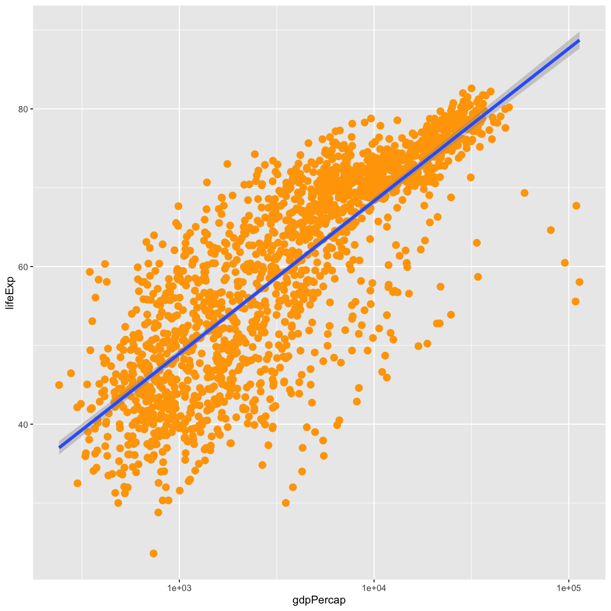
Challenge 9
Modify the color and size of the points on the point layer in the previous example.
Hint: do not use the
aesfunction.Solution
ggplot(data = gapminder, aes(x = gdpPercap, y = lifeExp)) +
 geom_point(size=3, color="orange") +
 scale_x_log10() +
 geom_smooth(method = "lm", size = 1.5)
Challenge 10
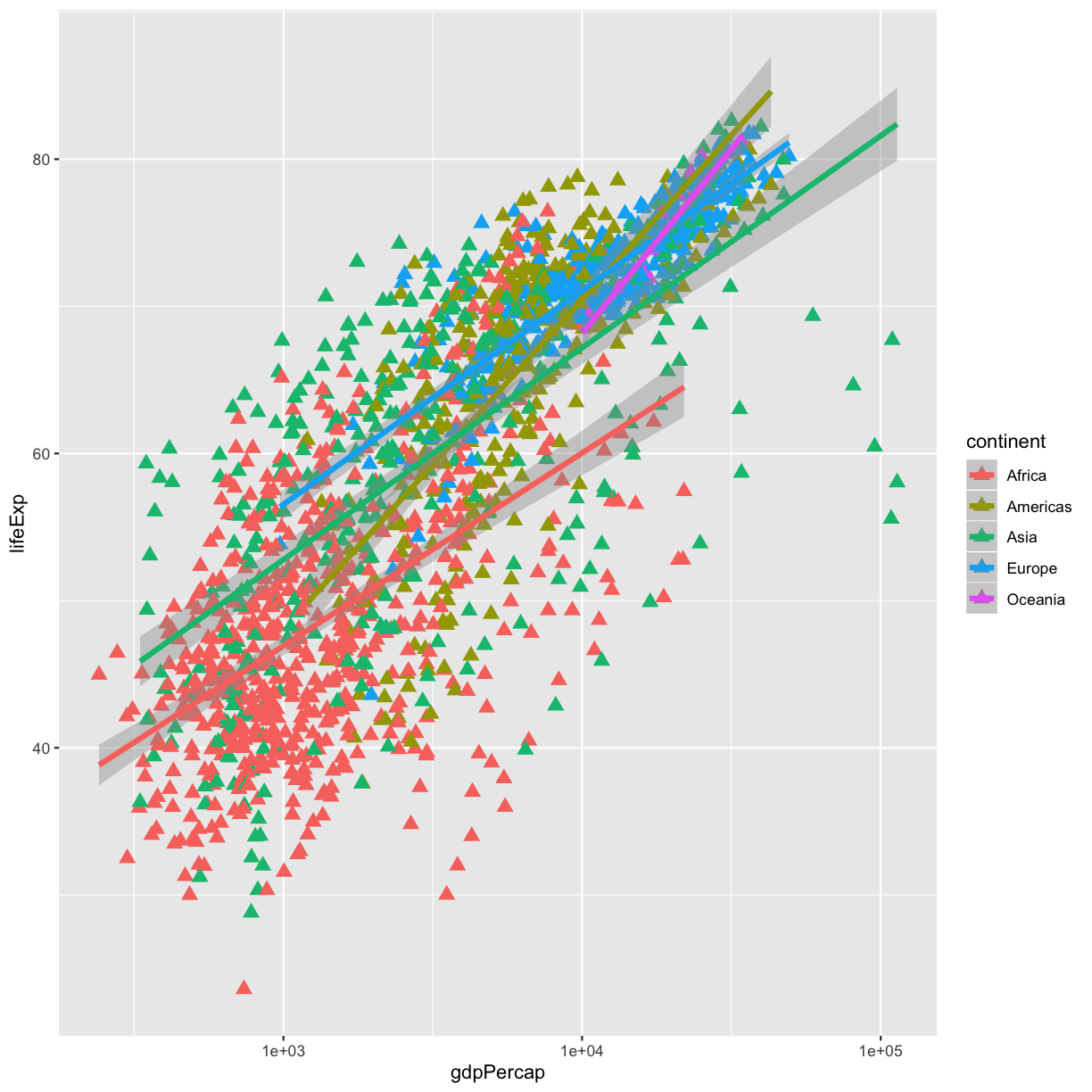
Modify your solution to Challenge 9 so that the points are now a different shape and are colored by continent with new trendlines. Hint: The color argument can be used inside the aesthetic.
Solution
ggplot(data = gapminder, aes(x = gdpPercap, y = lifeExp, color = continent)) +
  geom_point(size=3, shape=17) +
  scale_x_log10() +
  geom_smooth(method = "lm", size = 1.5)
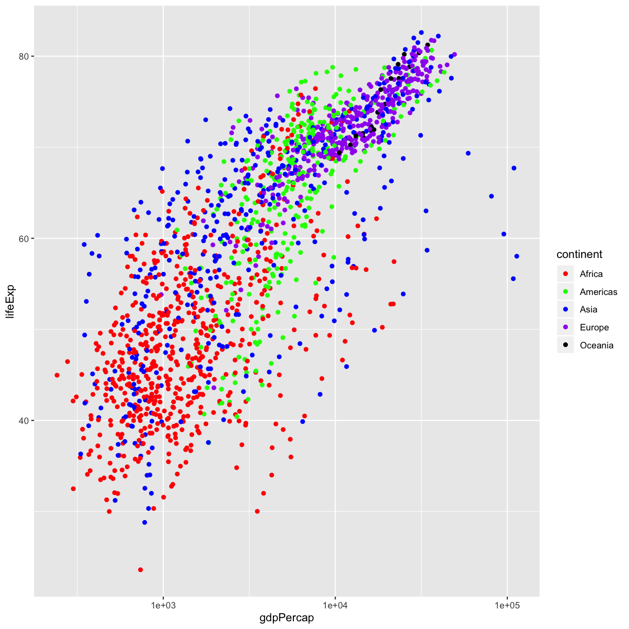
Scales don’t just apply to axes however. For example, we can take control of the colours used for the
colour scale by using scale_colour_manual(). This layer takes a values argument that lets us
specify the colours that the data values can be mapped to.
ggplot(data = gapminder, aes(x = gdpPercap, y = lifeExp, color = continent)) +
   geom_point() +
   scale_x_log10() +
   scale_colour_manual(values = c("red", "green", "blue", "purple", "black"))
Challenge 11
Try modifying the plot above by changing some colours in the scale to see if you can find a pleasing combination. Run the
colours()function if you want to see a list of colour names R can use.There is also a
scale_colour_brewer()scale that takes an argumentpalettethat is the name of a ColorBrewer palette. Select an appropriate colour palette for the continents from ColorBrewer and apply it to your plot instead.Solution
We will select the “Set1” palette for qualitative data.
ggplot(data = gapminder, aes(x = gdpPercap, y = lifeExp, color = continent)) +
  geom_point() +
  scale_x_log10() +
  scale_color_brewer(palette = "Set1")
Separating figures
Earlier we visualised the change in life expectancy over time across all countries in one plot. Alternatively, we can split this out over multiple panels by adding a layer of facet panels. To keep a manageable number, we will focus only on those countries with names that start with the letter “A”.
Tip
We start by subsetting the data. We use the
filterfunction from thedplyrpackage and thestr_starts()function to filter only countries with names that start with “A”.
a_countries <- filter(gapminder, str_starts(country, "A"))

ggplot(data = a_countries, aes(x = year, y = lifeExp, color = continent)) +
  geom_line() +
  facet_wrap( ~ country)
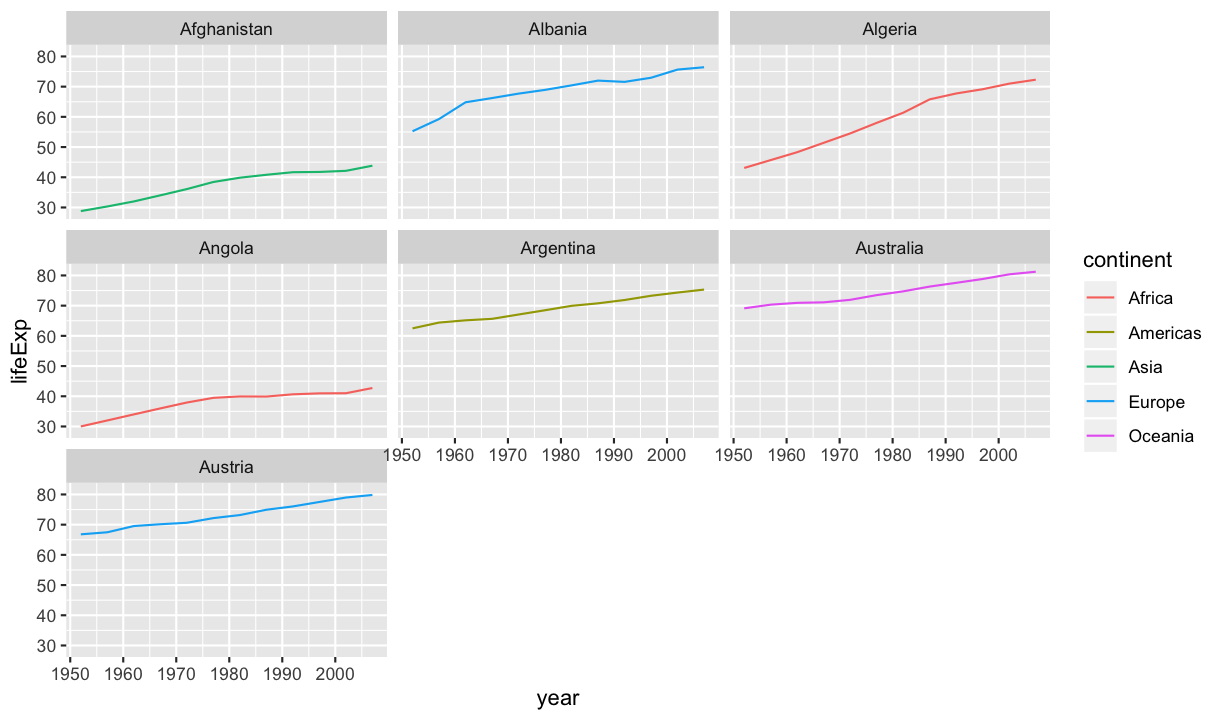
The facet_wrap layer took a “formula” as its argument, denoted by the tilde
(~). This tells R to draw a panel for each unique value in the country column
of the gapminder dataset. Each individual panel still has the same aesthetics/scale/geometries etc.
as each other.
Challenge 12
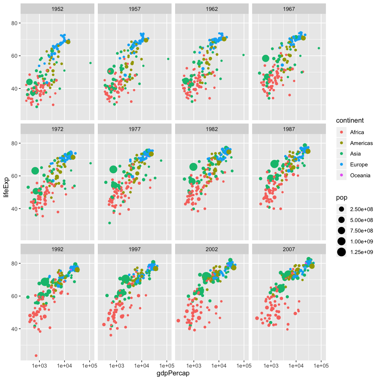
When discussing the gapminder video, we decided to ignore the animation component. Facets provide an option for achieving a similar effect in a static image. Take our original plot:
ggplot(
  data = gapminder_1977,
  mapping = aes(x = gdpPercap, y = lifeExp, colour = continent, size = pop)
) +
  geom_point() +
  scale_x_log10()
and modify it by
- using the full
gapminderdataset- adding a
facet_wrapto demonstrate the change through timeSolution
In this case, we want a separate panel per year, so we need to provide the
yearas the faceting variable.ggplot( data = gapminder, mapping = aes(x = gdpPercap, y = lifeExp, colour = continent, size = pop) ) + geom_point() + scale_x_log10() + facet_wrap( ~ year)
Our generic structure of a plot construction has been expanded somewhat, but the overall picture should feel familiar:
ggplot(<DATA>, <AESTHETIC MAPPING>) +
    <GEOMETRY FUNCTION> +
    <GEOMETRY FUNCTION> +
    <SCALE FUNCTION> +
    <FACET FUNCTION> +
    ...
The core approach of mapping data variables to aesthetic properties and applying those to geometries remains the same. But we have now seen how that process can be influenced by adding additional layers that modify the scales or add facets to a figure.
By combining these elements together you can start to build complex plots out of a number of small building blocks.
Challenge 13
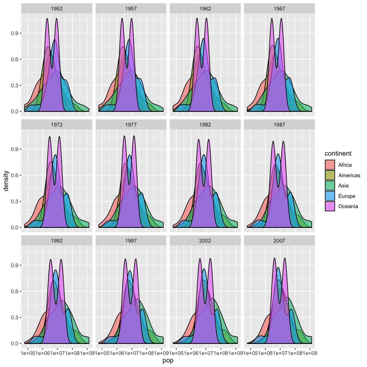
Create a density plot of population, filled by continent.
Advanced:
- Transform the x axis to better visualise the data spread.
- Add a facet layer to panel the density plots by year.
Solution to challenge 13
ggplot(data = gapminder, aes(x = pop, fill=continent)) +
 geom_density(alpha=0.6) +
 facet_wrap( ~ year) +
 scale_x_log10()
Challenge 14 - Advanced
Use the
agridatpackage to visualise some agricultural data.Explore the
blackman.wheatdataset fromagridat. Generate a plot that shows the effect of fertiliser treatment across genotypes (gen) and sites (loc).
Key Points
Use
ggplot2to create plots.Think about graphics in layers: aesthetics, geometry, statistics, scale transformation, and grouping.
