Introduction to Visualisation
Overview
Teaching: 120 min
Exercises: 120 minQuestions
What are the basic building blocks of visualisation
Objectives
To be able to identify the links between a data visualisation and the underlying data structure
To recognise the common visual features of a visualisation
Why visualisation?
We have spent a lot of time learning about manipulating and exploring data. What sort of information can we learn like that?
Let’s meet some datasets:
# A tibble: 1,846 x 3
   dataset     x     y
     <dbl> <dbl> <dbl>
 1       4  55.4  97.2
 2       4  51.5  96.0
 3       4  46.2  94.5
 4       4  42.8  91.4
 5       4  40.8  88.3
 6       4  38.7  84.9
 7       4  35.6  79.9
 8       4  33.1  77.6
 9       4  29.0  74.5
10       4  26.2  71.4
# … with 1,836 more rows
Get an idea of their overall structure:
summary(data)
    dataset         x               y
 Min.   : 1   Min.   :15.56   Min.   : 0.01512
 1st Qu.: 4   1st Qu.:41.07   1st Qu.:22.56107
 Median : 7   Median :52.59   Median :47.59445
 Mean   : 7   Mean   :54.27   Mean   :47.83510
 3rd Qu.:10   3rd Qu.:67.28   3rd Qu.:71.81078
 Max.   :13   Max.   :98.29   Max.   :99.69468
And some summary statistics for each dataset:
data %>%
  group_by(dataset) %>%
  summarise(
    mean_x = mean(x),
    mean_y = mean(y),
    sd_x = sd(x),
    sd_y = sd(y),
    correlation = cor(x,y)
  )
# A tibble: 13 x 6
   dataset mean_x mean_y  sd_x  sd_y correlation
     <dbl>  <dbl>  <dbl> <dbl> <dbl>       <dbl>
 1       1   54.3   47.8  16.8  26.9     -0.0641
 2       2   54.3   47.8  16.8  26.9     -0.0686
 3       3   54.3   47.8  16.8  26.9     -0.0683
 4       4   54.3   47.8  16.8  26.9     -0.0645
 5       5   54.3   47.8  16.8  26.9     -0.0603
 6       6   54.3   47.8  16.8  26.9     -0.0617
 7       7   54.3   47.8  16.8  26.9     -0.0685
 8       8   54.3   47.8  16.8  26.9     -0.0690
 9       9   54.3   47.8  16.8  26.9     -0.0686
10      10   54.3   47.8  16.8  26.9     -0.0630
11      11   54.3   47.8  16.8  26.9     -0.0694
12      12   54.3   47.8  16.8  26.9     -0.0666
13      13   54.3   47.8  16.8  26.9     -0.0656
Challenge 1
What can we say about these datasets just from looking at their summaries?
Let’s try plotting one of them to see if we can spot anything new:
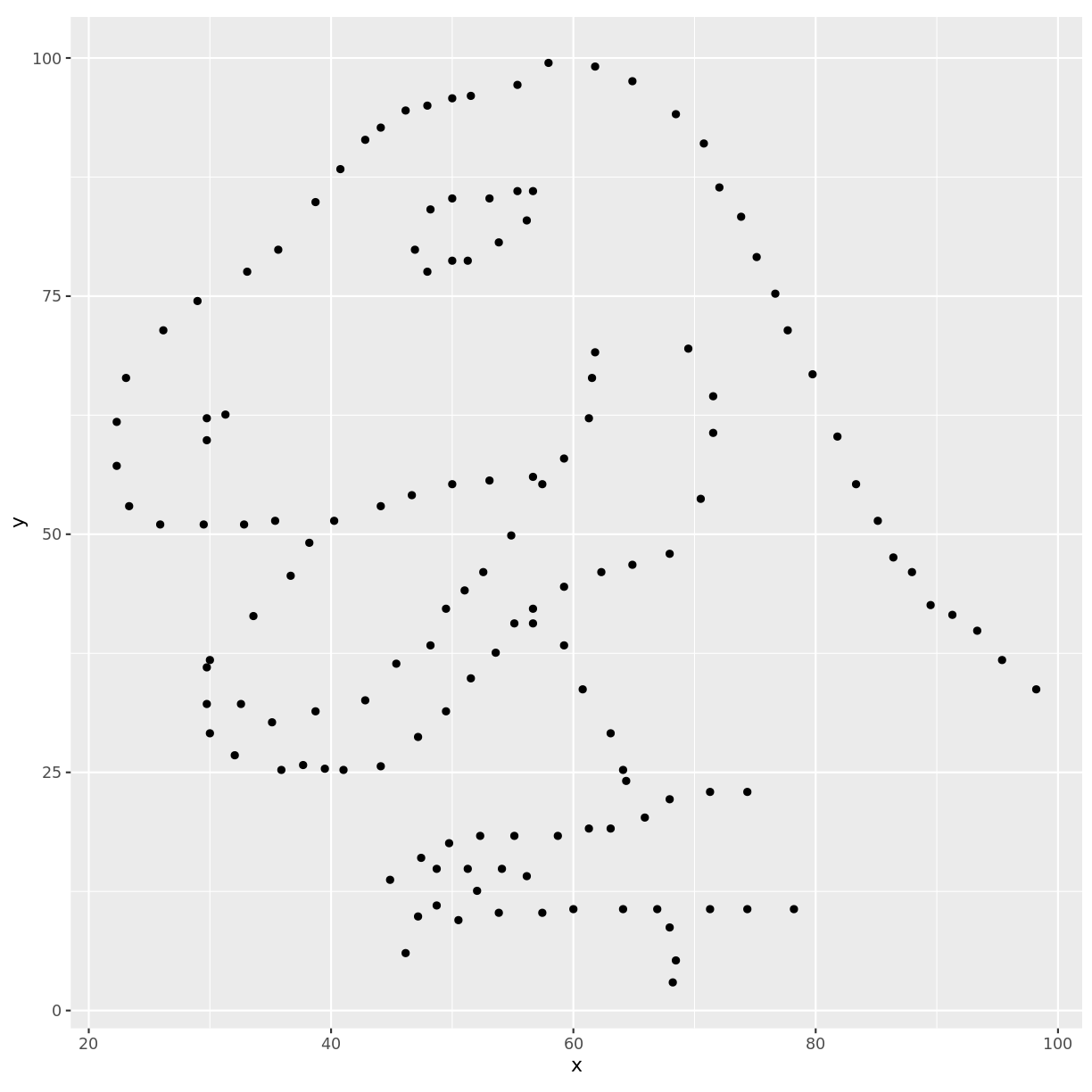
And it immediately becomes apparent what all those numbers mean
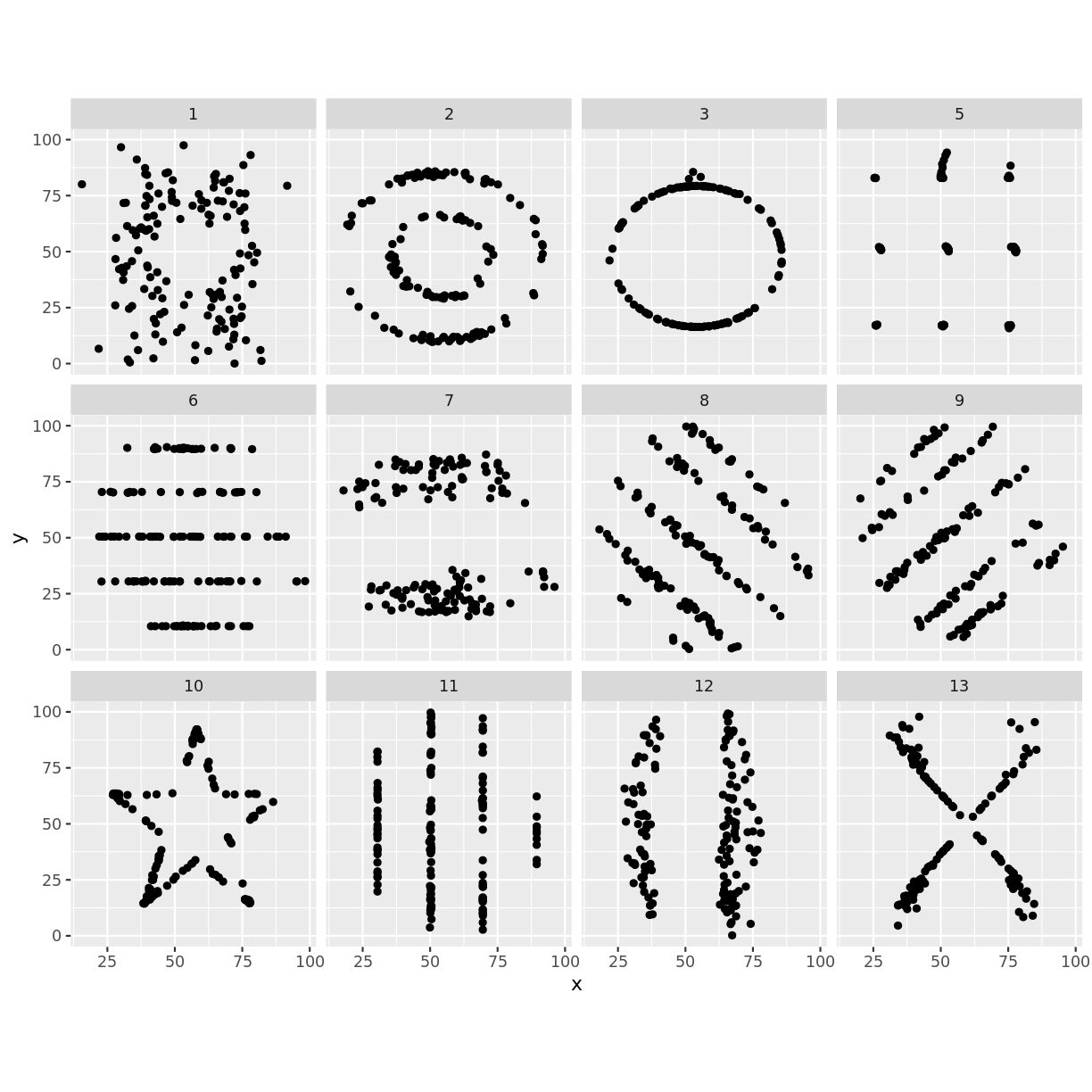
The other data sets we looked at are known as the datasaurus dozen. A group of 12 two-dimensional datasets that have identical:
- mean in both dimensions
- sd in both dimensions
- correlation between x and y
But…
Discussion - What is a data visualisation?
What is the difference between panel E and the other panels in the following figure?
The roles of data visualisation
In general there are two purposes behind data visualisations:
- As a discovery tool, to explore a dataset
- As a storytelling tool, to highlight features of a dataset
In both cases, a successful visualisation will illuminate and aid understanding, not confuse or obscure.
Discussion - What makes an effective data visualisation?
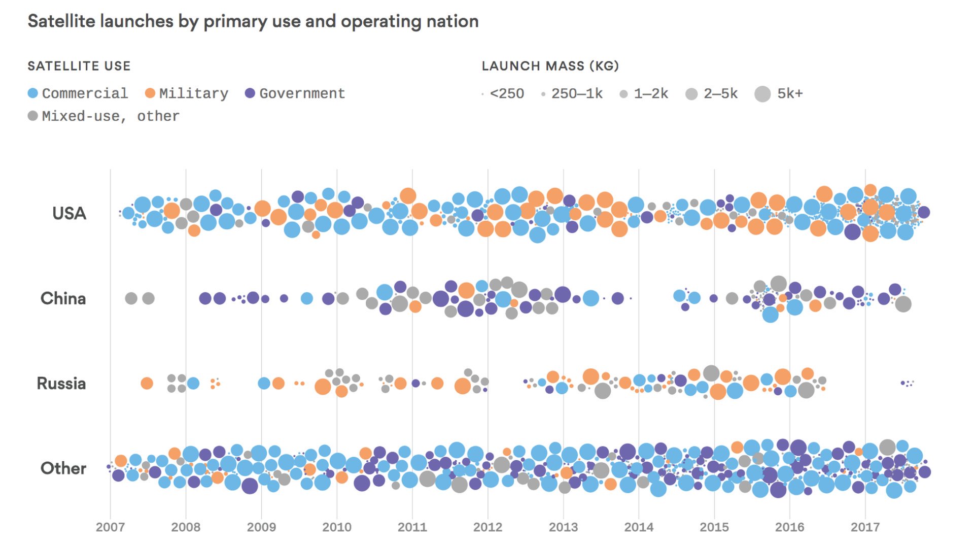
The figure below is from an Axios article about satellite launches.
How effective is this visualisation at conveying the story of the dataset, and what features do you feel contribute to that success?
Talking about visualisations
Our goal today will be to learn how to describe visualisations and their connections to data. We will build up a consistent vocabulary around visualisations that can be used to describe and create complex visualisations out of a series of simple tools.
The big concept of the day is any plot can be constructed by mapping variables in your data to visual properties (aesthetics) which are then applied to the physical marks (geometries) chosen to represent the data
Process outline

New terms
Aesthetic:
A visual property of the elements in a figure. Colour, size, and shape are all examples of aesthetics that affect the way your figure is displayed.
Geometry:
The physical representation of your data. Points, lines, and bars are examples of geometries that could be used to illustrate the data in a figure.
This will probably be a very big change in how you think about figures, let’s try it on a few examples.
Straight to a classic
Challenge
List the data elements contributing to this plot?
Hint: One way to answer this is to ask yourself what the column names in the underlying data frame might be.
What are some of the visual properties (aesthetics) used to convey this information?
Which aesthetics are linked with which data variables?
Solution
The major variable/aethetic mappings are:
Data Variable Visual Component Longitude x Axis Latitude y Axis Number of troops Line width Direction of travel Line colour Temperature y Axis (bottom chart) Date Text
Part of the reason this is a classic example of data visualisation is because of how information dense the image is and how clearly it conveys different elements of the data. Let’s try the same approach with a more recent figure.
A modern example?
List the data elements and visual aesthetics of the above figure.
How they are linked together?
Solution
Data Variable Visual Component No. landraces (l) x Axis No. gametes per landrace (g) y Axis r^2 decay distance z Axis r^2 decay distance Bar colour
Working on a single figure at a time doesn’t give a good idea of how changes to the aesthetics or geometries can affect a figure. Changing either of these components can hide or reveal information, and can sometimes completely change the story your figure is telling.
Consider the following set:
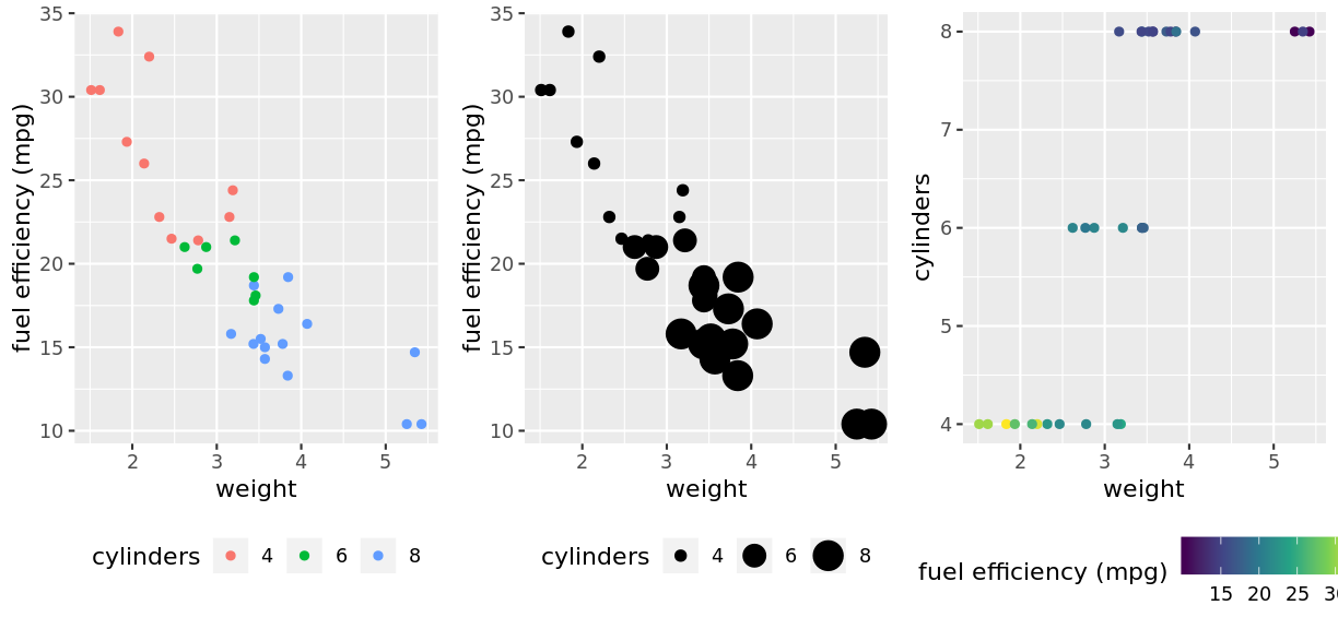
Changing aesthetics
Challenge
List the data elements, visual aesthetics, and geometries of the above figure to convince yourself that the only changes are in the mappings of the data to aesthetics.
Solution
Left figure:
Data Variable Aesthetic Weight x Axis Fuel efficiency y Axis No. of cylinders Colour Middle Figure:
Data Variable Aesthetic Weight x Axis Fuel efficiency y Axis No. of cylinders Size Right figure:
Data Variable Aesthetic Weight x Axis No. of cylinders y Asis Fuel efficiency Colour Each of these figures uses a point geometry
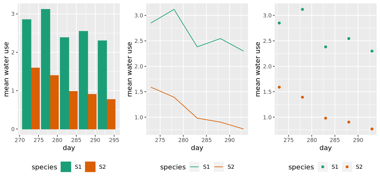
Changing geometries
Challenge
Compare the three plots above
- How are the data elements linked to the visual elements?
- What is the difference between the three?
- Do any of them tell a story more clearly?
Solution
All figures have the same aesthetic mapping:
Data Variable Aesthetic Day x Axis Mean water use y Axis Species Colour But each of them uses a different geometry to represent this data. Bars, lines, and points from left to right.
Challenge
Which of the following are aesthetics?
- Colour, size, shape
- X and Y axis
- Points, lines and bars
- Both (1) and (2)
Solution
The correct answer is 4. From a ‘grammer of graphics’ framework, the X and Y axes are visual elements just like colour, size, and shape. Geometry (e.g. lines, bars, points) is not - it affects how your aesthetic mappings are displayed, not what the aesthetics themselves are.
Scales
While the links between data, aesthetics, and geometries describe the core features of a visualisation, there are several other components that influence the final figure.
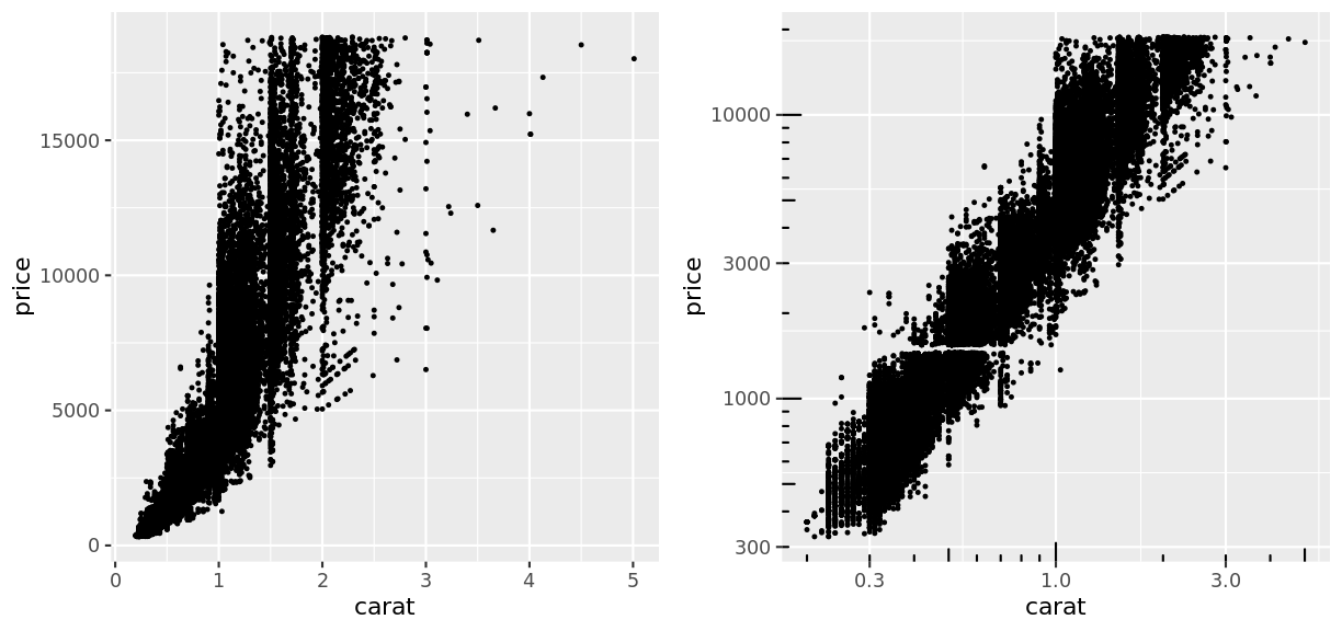
Consider the following pair of plots:
Challenge
Compare the two plots above
- How are the data elements linked to the visual elements?
- What term would you use to describe the difference between the two?
Solution
Each plot has exactly the same data, aesthetic mapping, and geometries. The only difference is that the x and y axis in the right hand figure is scaled logarithmically.
So this new concept extends our previous understanding of the visualisation process by affecting exactly how values of your data are assigned to values of the visual property.

New term
Scale:
Controls how data values get converted into their aesthetic values. For example, the scale of a colour aesthetic determines what colours the data points are assigned to.
To demonstrate that scaling is affecting the mapping of data to aesthetics, consider the following example:
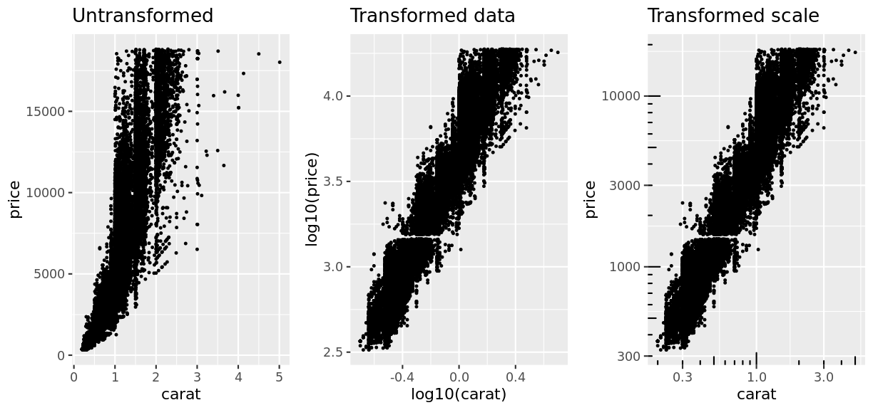
In one of these, the data is transformed before plotting. In the other, the data values are left unchanged and just the scaling as to how those data points are mapped to the x and y axis is altered.
Do you find each option easier or harder to interpret?
Scales apply to all visual properties, with colour being the easiest to observe differences:
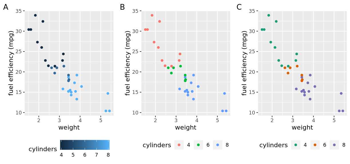
In this example, the cylinder variable is mapped to three different colour scales. One continuous (A) in which the values of cylinder are mapped to a spectrum of dark to light blue. The other two are categorical (B, C) in which the unique values of cylinder are mapped to individual colour values. The specific colour values are determined by the scale and are different between the two plots.
The choice of scale for your visualisations will depend on your data. Are they continuous or categorical? Can they be mapped directly onto an appropriate scale, or would a transformed scale better represent the data?
Coordinates
As with scales controlling the conceptual mapping of data to a visual property, coordinates control the physical mapping of geometries to positions on a screen/page.

New term
Coordinate system:
Controls how the points, lines, bars etc. of a visualisation get placed in physical space.
The coordinate system you are most familiar with is the Cartesian coordinate system. This is the x/y two dimensional plane that has been used in the examples so far.
A simple modification we could make to this system is to enforce a condition on the coordinates that our two dimensions have to be equal. In other words, a unit of length along the x axis is the same physical distance as a unit of length along the y axis:
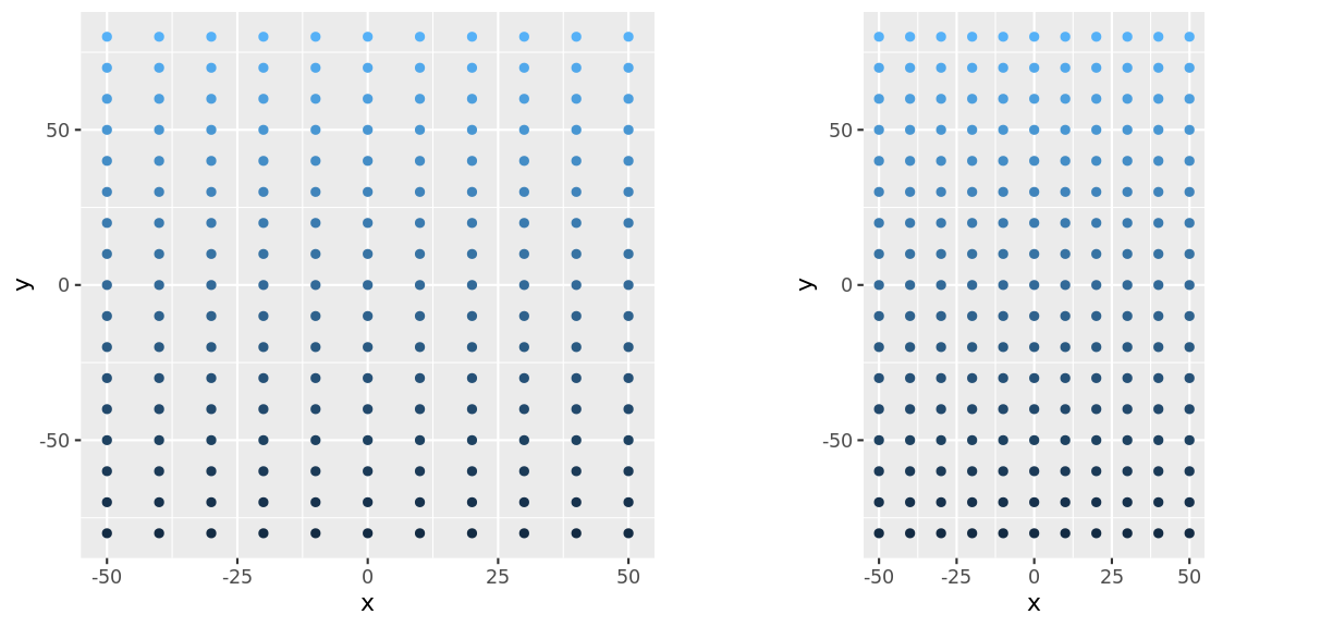
In this example, you can see that on the right hand figure, the distance between -50 and 0 on the x axis is exactly the sasme distance as between -50 and 0 on the y axis.
Discussion
Why might you choose to enforce this restriction on the coordinate system?
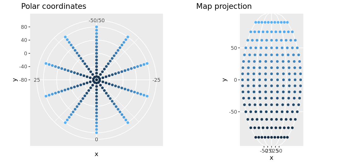
While this might seem like a small change, changing the coordinate system can have a drastic effect on the presentation of your data and how it is interpreted.
Discussion
The two plots above show exactly the same data as the grid previously. Do the changed coordinates change how you might interpret the data?
Applying your visualisation vocabulary
By now you have developed a vocabulary that will let you talk consistently about figures. Time to try it out on something you are familiar with.
Challenge
Select a figure you have produced, or one that you have seen and thought was very effective.
Describe the data they contain, how that data is mapped to the visual aesthetics and what geometries were chosen to represent the data. Did you have to consider the scale or coordinate system for the figure to get your deired point across?
Find a partner and share your figure and description. Do your figures share any common features?
This process allows you to decsribe a figure even if you are not familiar with how to create it.
Challenge - Advanced
Consider the following visualisation from The Guardian showing the change in voting patterns at the 2018 US elections:
How would you describe this visualisation?
Hint: You will need to create a new type of geometry that we haven’t discussed to describe this. What might you call it and what aesthetics will it use?
That special something
Until now, everything we have discussed has had some functional role in creating a figure. We have been talking about how to display our data with a visual representation that allows us to understand the features of our data. There are a lot of other aspects to a plot that can affect the final look however.
Challenge
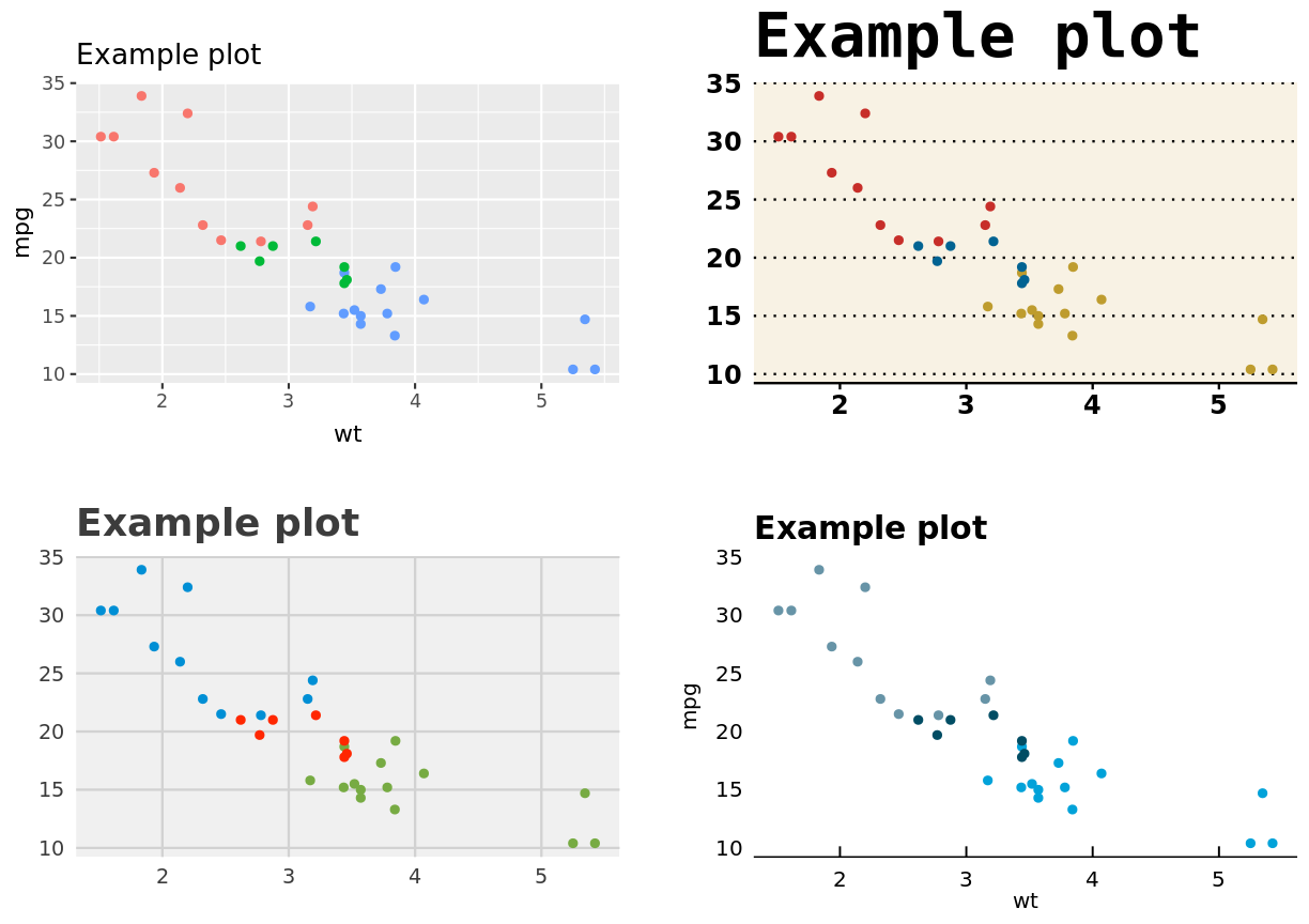
What changes between the following plots? What term would you use to describe these features?
These aspects to not change the data elements of a figure, but do have an impact on how the plot looks. We will refer to these as the theme of a visualisation.

New term
Theme:
Any non-data element of a visualisation. Changing these can still have a dramatic effect on the final presentation of the figure..
Key Points
Visualisation is valuable
There are common elements that link data to visual properties
By mapping data attributes to visual attributes clearer visualisation is possible
