Animations with gganimate
Overview
Teaching: 45 min
Exercises: 30 minQuestions
How can I animate plots?
When should I use animation?
Objectives
To understand the grammar of animation used in
gganimateTo describe the different transitions available
To select an appropriate transition for the data
Adding animation to your visualisations is an excellent way to make your work stand out. Human eyes will naturally focus on movement over a stationary object, so an animation will draw attention. Animations can also help with the explanatory power of a visualisation, as changes in motion are easily detectable.
There are several options for producing animated images in R. We will be introducing the gganimate
package here because it is an extension of the ggplot framework you are familiar with. On top of the
grammar of the ggplot system, gganimate adds a grammar of animation that determines how an animation
is constructed.
gganimate
To create an animation with gganimate, we will create a ggplot that consists of several discrete
static positions. The grammar introduced by gganimate will allow us to describe how the plot should
transition between these static states.
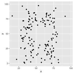
To understand this visually, it may be easiest to think about a plot where we have facetted by a variable:
# A familiar dataset
datasaurus
# A tibble: 1,846 x 3
   dataset     x     y
     <dbl> <dbl> <dbl>
 1      13  55.4  97.2
 2      13  51.5  96.0
 3      13  46.2  94.5
 4      13  42.8  91.4
 5      13  40.8  88.3
 6      13  38.7  84.9
 7      13  35.6  79.9
 8      13  33.1  77.6
 9      13  29.0  74.5
10      13  26.2  71.4
# … with 1,836 more rows
ggplot(datasaurus, aes(x = x, y = y)) +
  geom_point() +
  facet_wrap( ~dataset )

Each of these facets represents single state of our data. To animate this, we tell gganimate that
we would like to transition between these states with transition_states(). This function needs
the name of the column that defines the separate states of the data we are wanting to animate between.
In other words, the argument we provided to facet_wrap(), but without the ~.
datasaurus_anim <- ggplot(datasaurus, aes(x = x, y = y)) +
  geom_point() +
  transition_states( dataset )

datasaurus_anim
To produce a pleasing animation, you can specify the relative time spent transitioning between the states or showing the states.
# Three times as long transitioning as displaying the state
datasaurus_anim <- ggplot(datasaurus, aes(x = x, y = y)) +
  geom_point() +
  transition_states(dataset, transition_length = 3, state_length = 1)

datasaurus_anim
Where it is possible to do so, gganimate will transition smoothly between all aesthetic properties,
not just x/y position.
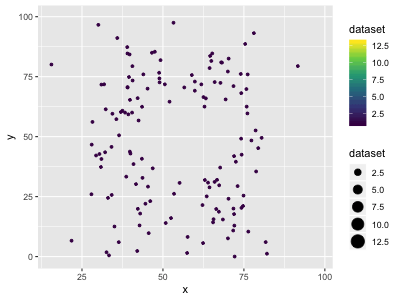
datasaurus_anim <- ggplot(datasaurus, aes(x = x, y = y, size = dataset, colour = dataset)) +
  geom_point() +
  transition_states(dataset, transition_length = 5, state_length = 1) +
  scale_colour_viridis_c()

datasaurus_anim
Creating your own
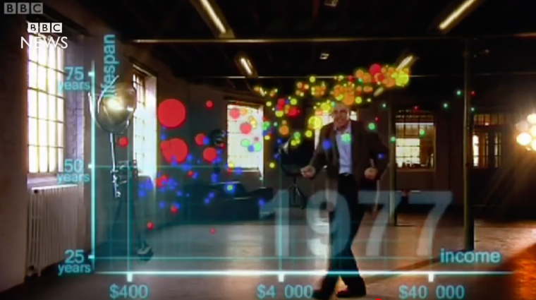
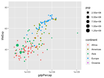
We will work predominantly with the gapminder data to allow you to explore animation yourself. To begin with, we will try recreating the animation you have already seen. Here is an example of a single state of this animation as a reminder:
To make something similar yourself:
Read in the gapminder data
Make a static plot that uses the aesthetic mappings from the above screenshot and save it as a variable.
Solution
gapminder_plot <- ggplot(gapminder, aes(x = gdpPercap, y = lifeExp, size = pop, colour = continent)) +
 geom_point() +
 scale_x_log10()

gapminder_plot
- Add a facet layer to the static plot to view each state of the data that we will transition between
Solution
gapminder_plot + facet_wrap(~year)
- Change the facet layer to a
transition_states()to convert the static image into an animationSolution
gapminder_plot + transition_states(year)
- Try different
transition_lengthandstate_lengthvalues to find a combination you like


Other transitions
transition_states() is a the most generic type of transition that can be used, but there are other
alternatives. These will be more appropriate for specific types of data or if a particular transition
is desired.
Time
If the states of your animation represent points in time, you can use transition_time(). This works
similarly to transition_states() except that the length of the transition is proportional to the
actual time between the states.
This creates an obvious difference just by substituting transition_time() for transition_states()
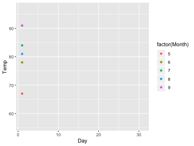
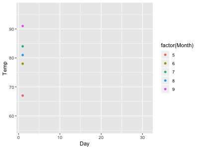
#With transition_states
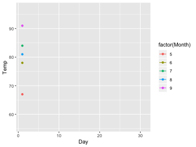
airqual_anim <- ggplot(airquality, aes(x = Day, y = Temp, colour = factor(Month))) +
geom_point() +
transition_states(Day)
airqual_anim
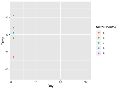
#With transition_time
airqual_anim <- ggplot(airquality, aes(x = Day, y = Temp, colour = factor(Month))) +
  geom_point() +
  transition_time(Day)

airqual_anim

But becomes even more obvious when your data is not recorded at regular time intervals.
#Missing data
airqual_missing <- airquality %>% filter(Day <= 10 | Day >= 20)

airqual_anim <- ggplot(airqual_missing, aes(x = Day, y = Temp, colour = factor(Month))) +
  geom_point() +
  transition_states(Day)

airqual_anim
#Missing data
airqual_missing <- airquality %>% filter(Day <= 10 | Day >= 20)

airqual_anim <- ggplot(airqual_missing, aes(x = Day, y = Temp, colour = factor(Month))) +
  geom_point() +
  transition_time(Day)

airqual_anim
Taking your time
Convert your gapminder animation from using
transition_states()totransition_time(). What effect has this had on your animation?Solution
gapminder_plot + transition_time(year)
Reveal
If you are displaying data in a connected fashion (eg. a line plot), you probably do not think of your visualisation as having separate states to transition between. Instead, you might want to add each state to the previous ones, slowly revealing your complete data along a particular dimension.
In this situation, you can use transition_reveal():
airqual_anim <- ggplot(airquality, aes(x = Day, y = Temp, colour = factor(Month))) +
  geom_line() +
  transition_reveal(Day)

airqual_anim
Unconnected geometries (such as points), will not be kept by transition_reveal(), so can be used
to mark the current position.
airqual_anim + geom_point()
Revealing your data
To test out
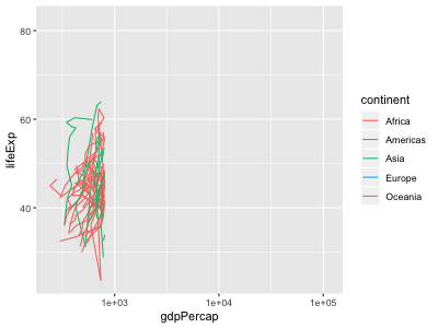
transition_reveal(), we need a plot containing ageom_line()orgeom_path(). For this exercise, use the following:gapminder_lines <- ggplot( data = gapminder, mapping = aes(x = gdpPercap, y = lifeExp, colour = continent, group = country) ) + geom_path() + scale_x_log10() gapminder_lines
Apply the following transitions to this plot:
transition_reveal(lifeExp)transition_reveal(gdpPercap)transition_reveal(year)Before running the code, think about what you expect the animation to look like. Did the final result match your expectations?
Solution
gapminder_lines + transition_reveal(lifeExp)
gapminder_lines + transition_reveal(gdpPercap)
gapminder_lines + transition_reveal(year)
What happens if you add a
geom_point()layer to any of these animations?


Layers
The final transition we will look at is transition_layers(). This does not transition between
different states of your data, but treats each layer of your plot as a separate state to be added in.
This transition might be useful if you want to slowly add additional information to a plot:
iris_plot <- ggplot(iris, aes(x = Species, y = Sepal.Length)) +
  geom_jitter() +
  geom_violin(alpha = 0.7) +
  geom_boxplot(colour = "steelblue", alpha = 0.7) +
  stat_summary(colour = "firebrick")

iris_anim <- iris_plot + transition_layers()

iris_anim
By default, transition_layers() will keep adding layers on top of each other in the order you applied
them in the code. You have a level of control over how layers are added and removed however, so you
can choose the comparisons you are wanting to make in the animation.
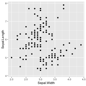
iris_plot <- ggplot(iris, aes(x = Sepal.Width, y = Sepal.Length)) +
  geom_point() +
  geom_smooth(method = "lm") +
  geom_smooth(method = "lm", formula = y ~ poly(x, 2)) +
  geom_smooth()

iris_anim <- iris_plot + transition_layers()

iris_anim
iris_anim <- iris_plot + transition_layers(
  from_blank = FALSE,
  keep_layers = c(Inf, 0, 0, 0)
)

iris_anim
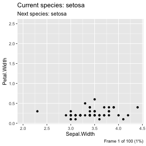
Titles
These transitions provide contextual information through a number of variables that can be included
in the plot labels. The variables are referenced using the glue style,
where the variable name is placed within {} and is replaced with its value when the animation is
created.
Each transition provides it’s own variables to refer to and these cn be found in the help pages for
the transition. For example, transition_states() can use
- closest_state: The name of the state closest to this frame
- next_state: The name of the next state the animation will be part of
- previous_state: The name of the last state the animation was at
- transitioning: A boolean indicating whether the frame is part of the transitioning phase
There are a few variables common to all transitions, including
- frame: Gives you the frame index for the current frame
- nframes: Gives you the total number of frames in the animation
- progress: Gives you the progress of the animation at the current frame
label_anim <- ggplot(iris, aes(x = Sepal.Width, y = Petal.Width)) +
  geom_point() +
  transition_states(Species) +
  labs(
    title = "Current species: {closest_state}",
    subtitle = "Next species: {next_state}",
    caption = "Frame {frame} of {nframes} ({progress * 100}%)"
  )

label_anim
Key Points
gganimateis an extension of theggplotplotting systemAdd a transition to plots to describe how to move from one display of the data to another