Introduction
I joined CSIRO in 2009 and worked in the Contract Administration Centre until 2014. Since then, I’ve covered a variety of roles supporting Project Support, In-Business Finance, the Research Office and currently the Project Support Centre (Corporate Finance.) Prior to commencing Data School, I could code competently in HTML and a little C, but its applications were largely restricted to extra-curricular activities away from CSIRO. Learning R and aspects of Data Management appealed to me as an attractive and valuable skill that could be applied in practice for the purposes of reporting, data management systems and general compliance activities.
My Project
From manual input to R workflow
This project could be best regarded as an attempt to replicate a process that is currently handled manually and consists of two primary components: 1) importing raw data, wrangling, tidying and transforming; 2) visualising and communicating. In this respect, R seemed like a perfect fit for the task at hand.
The PSC Monthly report
The current manual process consists of preparing a dataset for the Project Support Centre (PSC) monthly report. The monthly summary reports on the status of open and completed tasks, which have been recorded across JIRA and O2D. This summary ultimately informs part of the larger Finance Support Centre reporting at month end.
Issues with the manual process
One of the present issues with preparation of the PSC report is that it is a manual process and is therefore both time-consuming and potentially prone to data duplication and human error. The goal of this project was to examine the exisiting process and realise it through the application of R, taking JIRA/O2D data and transforming it efficiently, resulting in an end-goal of an accurate data summary.
The R workflow: replicating a manual process in Excel
In order to take this manual process and realise it as an R workflow, I would need to take the manual work steps currently performed across Excel (multiple spreadsheets, copying/pasting, filtering, pivot tables, cell references, etc) and replicate this in R code, employing a number of functions and successive dataframes to ensure the data was consilidated and going to the right place at the right time.
Wrangling, tidying, transforming
The goal of the R workflow was to wrangle large chunks of data - extracted from JIRA and O2D - and transform this into concise summaries of open and completed JIRA/O2D tasks for a given month. From here, the summaries are brought together, comprising of current and previous monthly data for an up-to-date summary of the Financial Year-To-Date.
NOTE: For the purposes of the PSC report, only the open statuses needed to be reported upon.
Preliminary results
Visualisation of data
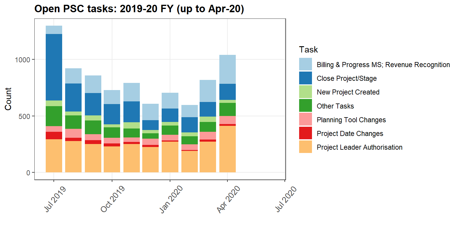
The following table and plot are the key components of the PSC Monthly Report, and form the basis of its presentation.
To present this data in Markdown, I have utilised internal R Markdown code to read in the data summary generated from my R workflow, assign new variables and used these datatables for a table and plot detailing open PSC tasks across the 2019-20 FY.
| 2019-20 FY | Jul | Aug | Sep | Oct | Nov | Dec | Jan | Feb | Mar | Apr | May | Jun |
|---|---|---|---|---|---|---|---|---|---|---|---|---|
| Billing & Progress MS; Revenue Recognition | 73 | 137 | 156 | 124 | 163 | 144 | 140 | 108 | 195 | 256 | 0 | 0 |
| Close Project/Stage | 589 | 247 | 197 | 179 | 184 | 86 | 120 | 135 | 130 | 141 | 0 | 0 |
| New Project Created | 50 | 33 | 46 | 28 | 57 | 30 | 31 | 34 | 47 | 27 | 0 | 0 |
| Other Tasks | 175 | 120 | 119 | 93 | 79 | 47 | 82 | 71 | 86 | 115 | 0 | 0 |
| Planning Tool Changes | 52 | 80 | 53 | 50 | 40 | 55 | 50 | 52 | 70 | 72 | 0 | 0 |
| Project Date Changes | 66 | 29 | 35 | 26 | 18 | 20 | 11 | 7 | 17 | 16 | 0 | 0 |
| Project Leader Authorisation | 292 | 276 | 251 | 229 | 250 | 224 | 271 | 190 | 273 | 412 | 0 | 0 |

Figure 1: Table summary of open PSC tasks for 2019-20 FY (up to April 2020)
Animation of plots
Although I don’t imagine that animation will be incorporated into regular reporting in the immediate future, I thought it would be good to include some examples in this presentation. Since using ggplot, I’ve noted gganimate’s potential to provide enhanced insight into data summaries.
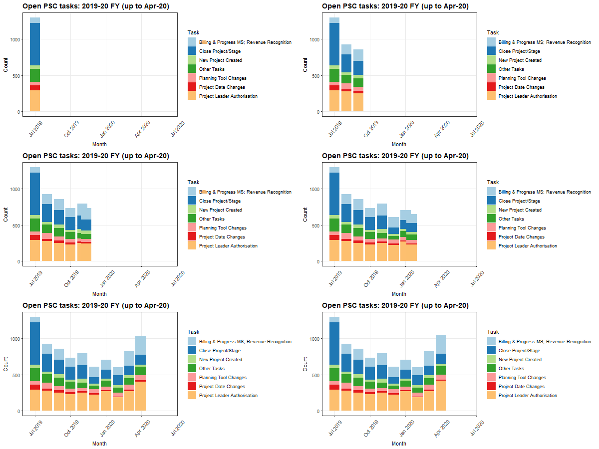
The following is an animation of the above chart. I think the animated aspect lends greater insight into task volume over the course of the year and is indicative of particular trends, especially prior to and following the EOFY period.
The animation incorporates transition_time() and shadow_mark() functions, whilst an ease_aes() function smooths the transitions. The timing of the animation is controlled further by rendering the animation using the animate() function.

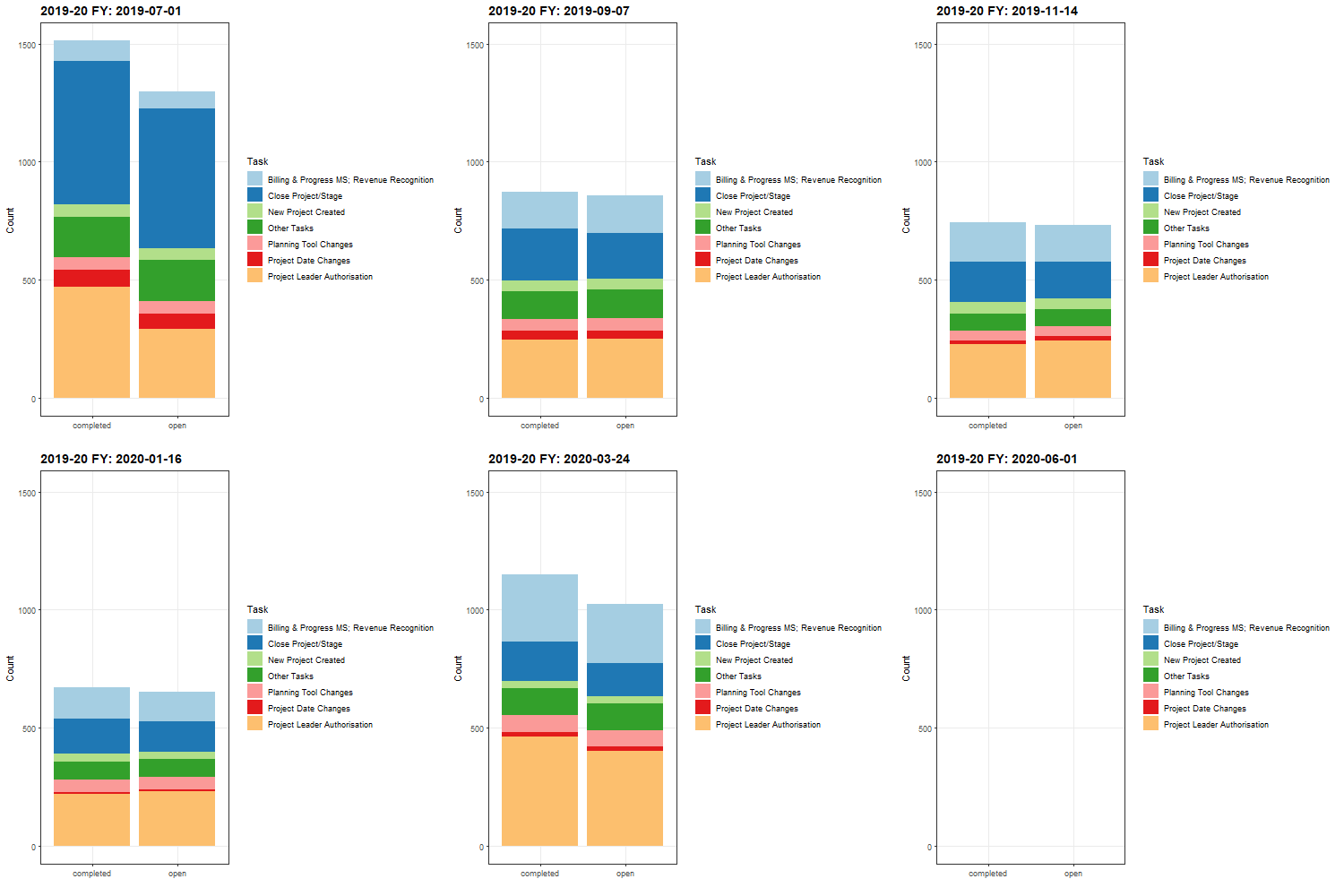
Although this next animation is less useful for the purposes of reporting, I thought it would be interesting to examine both open and completed task statuses transitioned over each month, utilising a facetwrap() function to position each task status side-by-side for comparison.
A potential improvement to the animated plot could be to fix the date stamp and replace this with the name of the month following each monthly transition.

My Digital Toolbox
The tidyverse and ggplot libraries have been the primary tools I’ve used for the project.
At this stage, I feel like I’ve got a workable ‘readymade’ of how I imagine the finished project will perform. However, features such as interactivity (i.e. shiny) are very tempting to explore further and could be of great benefit to end-users in the future.
As this project is revisited in the coming weeks and months, it will be interesting to see what other tools might be applied to best realise the goals and ultimate outcome of the workflow project.
My time went …
The most labour-intensive aspect of this project involved analysing the current (manual) report process and transposing this into an R workflow.
Because so much of the manual process involved hands-on copying/pasting, substituting of fields, filtering, creating pivot table summaries and so forth, the major challenge was identifying practical approaches in R and drawing from the experience I’d gained to date.
At times, this process was incredibly frustrating, though I found that most of the issues could be overcome by taking a step back and thinking about a particular part of the process in the simplest possible way. Asking lots of questions helped as well! When worst came to worst, I’d simply get a large sheet of paper out and draw out the process for the upteenth time. Once I was immersed back in the code, tried and true functions such as filter(), split(), select(), mutate(), rename(), group_by() and summarise() were indispensable.
Next steps
Although I managed to get the project up to the point where the workflow process executed near-perfectly (and accurately!), I would have really liked to reduce the volume of code in my script and find more efficient ways of performing certain functions. Duplication was an ongoing concern, and particular care needed to be taken to avoid errors.
Looking ahead, I would like to spend more time creating my own functions to avoid duplicated code as well as exploring regular expressions, strings and iteration in greater detail. Above all, spending more time with the general theory of R is a key motivator; insofar, that I recently purchased the R For Data Science book for my iPad!
Beyond R itself, becoming accustomed with other principles of Data Science and Data Management during this course has been enormously beneficial and I imagine that this will have valuable applications for myself and the rest of my Team in Finance going forward.
My Data School Experience
My time with Data School has been an interesting and hugely rewarding experience. At the start of the course I was quite unsure of how my project might fit into the world of Data Science, whilst learning amongst scientists and researchers certainly made me feel a little out of my depth (and out of place) from time to time. Nevertheless, as I gained more exposure to the fundamentals of R, Data Science and the general philosophy of Data School I felt much more at home and this eventually assured me that my project was on the right track and in good company.
Looking ahead, I’m keen to share my experience with my immediate Team and the wider CSIRO Finance community. Data School is a great platform for not only gaining and applying skills in R and Data Management, but being also part of a diverse, supportive and vibrant community.
Thank you:
I would like to take this opportunity to extend my huge thanks to our amazing instructors, Stephen and Kerensa, whose knowlege, suggestions and patience have been an invaluable resource to draw from over the past ten weeks.
Thanks to our gracious and accomodating facilitator, Kristian; the vast community of Data School Helpers, as well as my Finance-based helper, Dan Nguyen.
Thanks also to my managers, Creswell and Dikesh for allowing me the flexibility to undertake this course. Lastly, my thanks must also go out to my immediate Team members, Lisa and Maree in Project Support for providing vital cover whilst I’ve been up to my neck in code and managing a swelling head.